Climate Illuminated

North Pole Temperatures

Slide 13 in this series.
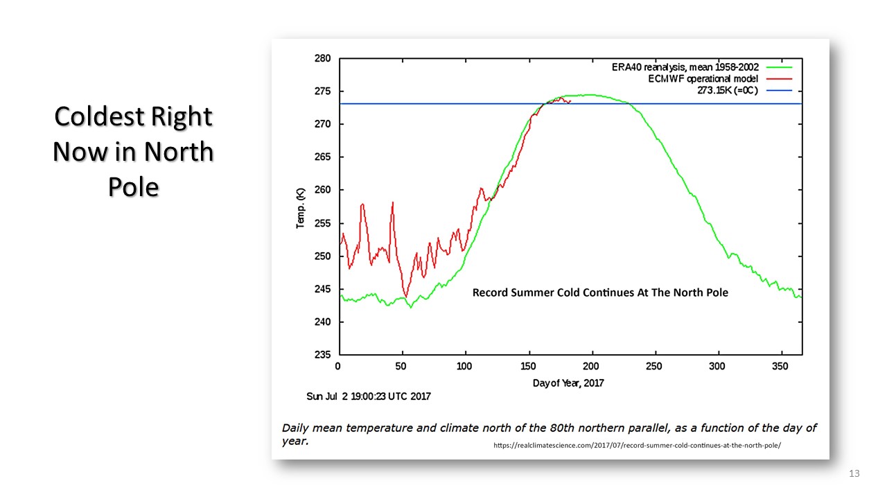
The North Pole in the artic region is one of many areas of interest. Al Gore predicted that this region would be free of ice before this time. So since the NH (Northern Hemisphere) has twice the area of land than the SH (Southern Hemisphere), it is most likely that the Artic region would be warmer than the corresponding southern pole or Antarctica.
The data graph below would suggest that currently in the year we are in, 2017, that the Artic region has cooled off. The green curve is the curve representing the years 1969 - 2002, and the red line the data curve for 2017. As one can see the temperature for the first portion of 2017 was warmer than the average for the 30 years of the green curve. As El Nino effects dissapated which they were reported to have done by the middle of 2017, the temperature cooled significantly.

NEXT: As we reach the question that the temperature in this year is showing signs of recovery in various regions, we can turn our attention to the comparison of the two satellite measurements: RSS and UAH.
A full range of topics on how global temperature works, is reported, adjusted, and some insignts into its accuracy.