Temperature Pause
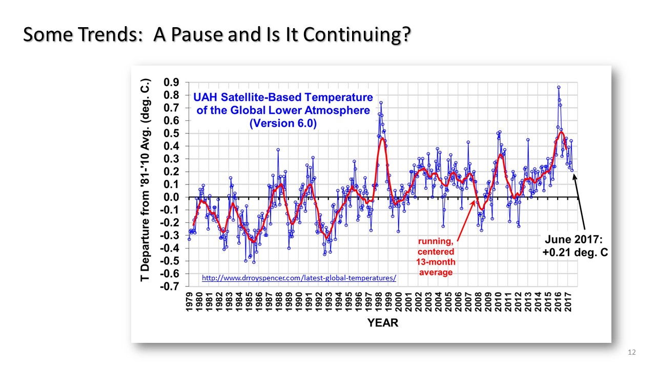
Slide 12 in this series.
In the graph below the so-called pause in recent temperatures over the past nearly 20 years is most apparent. We can also see the 2 peaks over this 20 year time period as related to years of El Nino. Remembering the temperatures for the summer months in the USA in which these peaks are not as apparent, one can see that this global temperature shows for these two peaks that the temperature rose in another part of the world than the land mass of USA.
It turns out that for 2016, the year that is being sold as the warmest ever (which is not true) was the result of El Nino and the anomaly temperatures around the Artic ocean.
NEXT: Many attempts have been made to adjust away the pause, and more will be written about those attempts in this website. But first we will jump to the North Pole for an update on temperatures there.
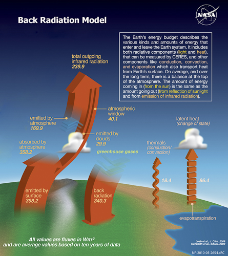
A full range of topics on how global temperature works, is reported, adjusted, and some insignts into its accuracy.