GCM Overstating Warming?
Guest Blogger / September 27, 2017
by Ross McKitrick
A number of authors, including the IPCC, have argued that climate models have systematically overstated the rate of global warming in recent decades. A recent paper by Millar et al. (2017) presented the same finding in a diagram of temperature change versus cumulative carbon emissions since 1870.
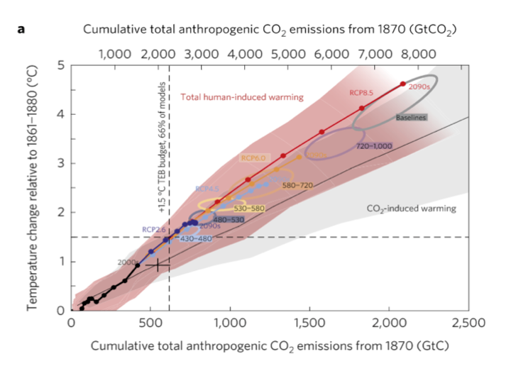
The horizontal axis is correlated with time but by using cumulative CO2 instead the authors infer a policy conclusion. The line with circles along it represents the CMIP5 ensemble mean path outlined by climate models. The vertical dashed line represents a carbon level where two thirds of the climate models say that much extra CO2 in the air translates into at least 1.5 oC warming. The black cross shows the estimated historical cumulative total CO2 emissions and the estimated observed warming. Notably it lies below the model line. The models show more warming than observed at lower emissions than have occurred. The vertical distance from the cross to the model line indicates that once the models have caught up with observed emissions they will have projected 0.3 oC more warming than has been seen, and will be very close (only seven years away) to the 1.5 oC level, which they associate with 615 GtC. With historical CO2 emissions adding up to 545 GtC that means we can only emit another 70 GtC, the so-called “carbon budget.”
Extrapolating forward based on the observed warming rate suggests that the 1.5 oC level would not be reached until cumulative emissions are more than 200 GtC above the current level, and possibly much higher. The gist of the article, therefore, is that because observations do not show the rapid warming shown in the models, this means there is more time to meet policy goals.
As an aside, I dislike the “carbon budget” language because it implies the existence of an arbitrary hard cap on allowable emissions, which rarely emerges as an optimal solution in models of environmental policy, and never in mainstream analyses of the climate issue except under some extreme assumptions about the nature of damages. But that’s a subject for another occasion.
Were Millar et al. authors right to assert that climate models have overstated recent warming? They are certainly not the first to make this claim. Fyfe et al. (2013) compared Hadley Centre temperature series (HadCRUT4) temperatures to the CMIP5 ensemble and showed that most models had higher trends over the 1998-2012 interval than were observed:
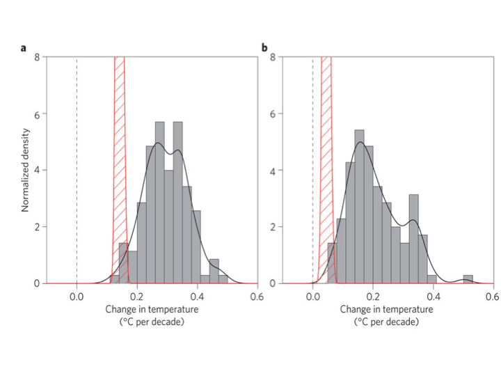
Original caption: a, 1993–2012. b, 1998–2012. Histograms of observed trends (red hatching) are from 100 reconstructions of the HadCRUT4 dataset1. Histograms of model trends (grey bars) are based on 117 simulations of the models, and black curves are smoothed versions of the model trends. The ranges of observed trends reflect observational uncertainty, whereas the ranges of model trends reflect forcing uncertainty, as well as differences in individual model responses to external forcings and uncertainty arising from internal climate variability.
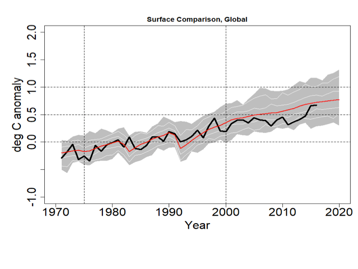
The IPCC’s Fifth Assessment Report also acknowledged model over-estimation of recent warming in their Figure 9.8 and accompanying discussion in Box 9.2. I have updated the IPCC chart as follows. I set the CMIP5 range to gray, and the thin white lines show the (year-by-year) central 66% and 95% of model projections. The chart uses the most recent version of the HadCRUT4 data, which goes to the end of 2016. All data are centered on 1961-1990.
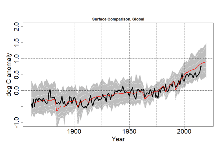
Even with the 2016 EL-Nino event, the HadCRUT4 series does not reach the mean of the CMIP5 ensemble. Prior to 2000 the longest interval without a crossing between the red and black lines was 12 years, but the current one now runs to 18 years.
This would appear to confirm the claim in Millar et al. that climate models display an exaggerated recent warming rate not observed in the data.
Zeke Hausfather has disputed this in a posting for Carbon Brief. He presents a different-looking graph that seems to show HadCRUT4 and the other major data series lining up reasonably well with the CMIP5 (RCP4.5) runs.
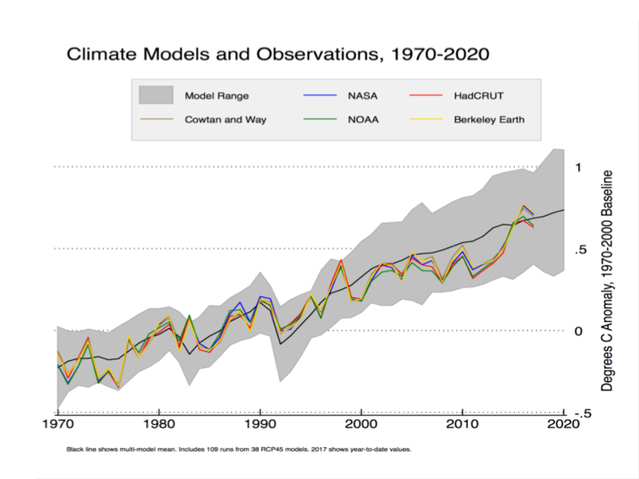
Hausfather isn’t using the CMIP5 runs as shown by the IPCC; instead he is using data from a different archive that modifies the outputs in a way that tilts the post-2000 model trends down. Cowtan et al. (2015) argued that, for comparisons such as this, climate model outputs should be sampled in the same way that the HadCRUT4 (and other) surface data are sampled, namely using Surface Air Temperatures (SAT) over land, Sea Surface Temperatures (SST) over water, and with maskings that simulate the treatment of areas with missing data and with ice cover rather than open ocean. Global temperature products like HadCRUT use SST data as a proxy for Marine Air Temperature (MAT) over the oceans since MAT data are much less common than SST. Cowtan et al. note that in the models, SST warms more slowly than MAT but the CMIP5 output files used by the IPCC and others present averages constructed by blending MAT and SAT, rather than SST and SAT. Using the latter blend, and taking into account the fact that when Arctic ice coverage declines, some areas that had been sampled with SAT are replaced with SST, Cowtan et al. found that the discrepancy between models and observations declines somewhat.
Figure 4 in Cowtan et al. shows that the use of SAT/SST (“blended”) model output data doesn’t actually close the gap by much: the majority of the reconciliation happens by using “updated forcings”, i.e. peeking at the answer post-2000
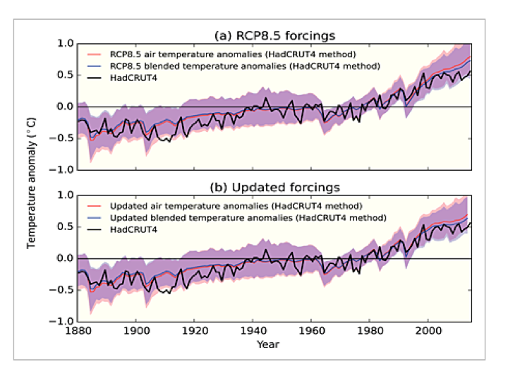
.Top: effect of applying Cowtan et al. blending method (change from red to green line)
Bottom: effect of applying updated forcings that use post-2000 observations
Hausfather also uses a slightly later 1970-2000 baseline. With the 2016 El Nino at the end of the record a crossing between the observations and the modified CMIP5 mean occurs.
In my version (using the unmodified CMIP5 data) the change to a 1970-2000 baseline would yield a graph like this:
The 2016 HadCRUT4 value still doesn’t match the CMIP5 mean, but they’re close. The Cowtan et al. method compresses the model data above and below so in Zeke’s graph the CMIP5 mean crosses through the HadCRUT4 (and other observed series’) El Nino peak. That creates the visual impression of greater agreement between models and observations, but bear in mind the models are brought down to the data, not the other way around. On a 1970-2000 centering the max value of the CMIP5 ensemble exceeds 1C in 2012, but in Hausfather’s graph that doesn’t happen until 2018.
The basic logic of the Cowtan et al. paper is sound: like should be compared with like. The question is whether their approach, as shown in the Hausfather graph, actually reconciles models and observations.
It is interesting to note that their argument relies on the premise that SST trends are lower than nearby MAT trends. This might be true in some places but not in the tropics, at least prior to 2001. The linked paper by Christy et al. shows the opposite pattern to the one invoked by Cowtan et al. Marine buoys in the tropics show that MAT trends were negative even as the SST trended up, and a global data set using MAT would show less warming than one relying on SST, not more. In other words, if instead of apples-to-apples we did an oranges-to-oranges comparison using the customary CMIP5 model output comprised of SAT and MAT, compared against a modified HadCRUT4 series that used MAT rather than SST, it would have an even larger discrepancy since the modified HadCRUT4 series would have an even lower trend.
More generally, if the blending issues proposed by Cowtan et al. explain the model-obs discrepancy, then if we do comparisons using measures where the issues don’t apply, there should be no discrepancy. But, as I will show, the discrepancies show up in other comparisons as well.
Swanson (2013) compared the way CMIP3 and CMIP5 models generated extreme cold and warm events in each gridcell over time. In a warming world, towards the end of the sample, each location would be expected to have a less-than-null probability of a record cold event and a greater-than-null probability of a record warm event each month. Since the comparison is done only using frequencies within individual grid cells it doesn’t require any assumptions about blending the data. The expected pattern was found to hold in the observations and in the models, but the models showed a warm bias. The pattern in the models had enough dispersion in CMIP3 to encompass the observed probabilities, but in CMIP5 the model pattern had a smaller spread and no overlap with observations. In other words, the models had become more like each other but less like the observed data.
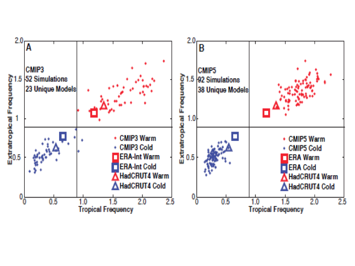
(Swanson Fig 2 Panels A and B)
The importance here is that this comparison is not affected by the issues raised by Cowtan et al, so the discrepancy shouldn’t be there. But it is.
Comparisons between model outputs for the Lower Troposphere (LT) and observations from weather satellites (using the UAH and RSS products) are not affected by the blending issues raised in Cowtan et al. Yet the LT discrepancy looks exactly like the one in the HadCRUT4/CMIP5 comparison.
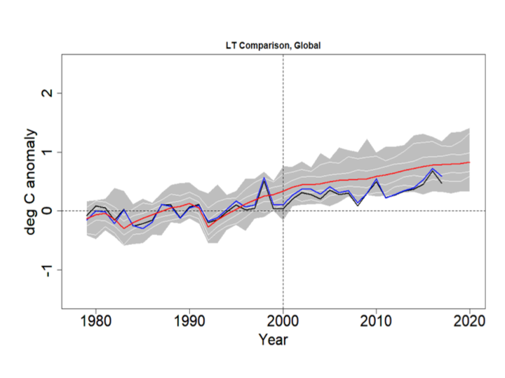
The blue line is RSS, the black line is UAH, the red line is the CMIP5 mean and the grey bands show the RCP4.5 range. The thin white lines denote the central 66% and 95% ranges. The data are centered on 1979-2000. Even with the 2016 El Nino the discrepancy is visible and the observations do not cross the CMIP5 mean after 1999.
A good way to assess the discrepancy is to test for common deterministic trends using the HAC-robust Vogelsang-Franses test (see explanation here). Here are the trends and robust 95% confidence intervals for the lines shown in the above graph, including the percentile boundaries.
UAHv6.0 0.0156 C/yr ( 0.0104 , 0.0208 )
RSSv4.0 0.0186 C/yr ( 0.0142 , 0.0230 )
GCM_min 0.0252 C/yr ( 0.0191 , 0.0313 )
GCM_025 0.0265 C/yr ( 0.0213 , 0.0317 )
GCM_165 0.0264 C/yr ( 0.0200 , 0.0328 )
GCM_mean 0.0276 C/yr ( 0.0205 , 0.0347 )
GCM_835 0.0287 C/yr ( 0.0210 , 0.0364 )
GCM_975 0.0322 C/yr ( 0.0246 , 0.0398 )
GCM_max 0.0319 C/yr ( 0.0241 , 0.0397 )
All trends are significantly positive, but the observed trends are lower than the model range. Next I test whether the CMIP5 mean trend is the same as, respectively, that in the mean of UAH and RSS, UAH alone and RSS alone. The test scores are below. All three reject at <1%. Note the critical values for the VF scores are: 90%:20.14, 95%: 41.53, 99%: 83.96.
H0: Trend in CMIP5 mean =
Trend in mean obs 192.302
Trend in UAH 405.876
Trend in RSS 86.352
In addition to the above comparison, if the treatment of Arctic sea ice is the major problem, there should be no issues when confining attention to the tropics. Also, since models project the strongest response to GHG warming in the tropical LT, this is where models and observations ought best to agree.
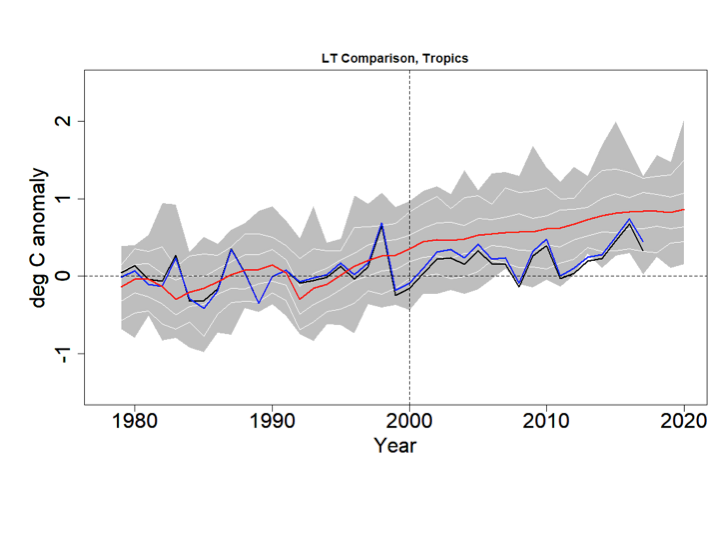
Again the blue line is RSS, the black line is UAH, the red line is the CMIP5 mean, the grey bands show the RCP4.5 range and the thin white lines denote the central 66% and 95% ranges. The data are centered on 1979-2000.
Trends:
UAHv6.0 0.0102 C/yr ( 0.0037 , 0.0167 )
RSSv4.0 0.0139 C/yr ( 0.0085 , 0.0193 )
GCM_min 0.0282 C/yr ( 0.0199 , 0.0365 )
GCM_025 0.0277 C/yr ( 0.021 , 0.0344 )
GCM_165 0.0281 C/yr ( 0.0207 , 0.0355 )
GCM_mean 0.0289 C/yr ( 0.0209 , 0.0369 )
GCM_835 0.0296 C/yr ( 0.021 , 0.0382 )
GCM_975 0.032 C/yr ( 0.0239 , 0.0401 )
GCM_max 0.0319 C/yr ( 0.023 , 0.0408 )
H0: Trend in CMIP5 mean =
Trend in mean obs 229.683
Trend in UAH 224.190
Trend in RSS 230.100
All trends are significantly positive and the models strongly reject against the observations. Interestingly the UAH and RSS series both reject even against the (year-by-year) lower bound of the CMIP5 outputs (p<1%).
Finally, Tim Vogelsang and I showed a couple of years ago that the tropical LT (and MT) discrepancies are also present between models and the weather balloon series back to 1958.
Millar et al. attracted controversy for stating that climate models have shown too much warming in recent decades, even though others (including the IPCC) have said the same thing. Zeke Hausfather disputed this using an adjustment to model outputs developed by Cowtan et al. The combination of the adjustment and the recent El Nino creates a visual impression of coherence. But other measures not affected by the issues raised in Cowtan et al. support the existence of a warm bias in models. Gridcell extreme frequencies in CMIP5 models do not overlap with observations. And satellite-measured temperature trends in the lower troposphere run below the CMIP5 rates in the same way that the HadCRUT4 surface data do, including in the tropics. The model-observational discrepancy is real, and needs to be taken into account especially when using models for policy guidance.
We should revisit occasionally what the proper role of government is. As the constitution was a good sense of direction, we need a core set of principles to add in order to deal with the future.
So many want to engineer society, remove risk, assist certain groups, rather than let individuals thrive and raise communities. Why?
Is Democracy where we all "get it good and hard" or is it the best means to a free society?
Should we roll with the special interests, or make the government achieve its proper role, what is that role, and how to do this?
When do deficits and governments become too large?
Government is becoming more elitist while trying to sell corrections to problems it created, what makes this possible?
GCM Model Errors estimate of the large error
GCM Model Results The results of the IPCC
GCM do not model Convection Well
Patrick Michaels on GCM Models