Climate Illuminated

Current Mass Greenland Ice
Greenland is used as a bellwether for ice in general and sea levels as well. In the 2016/17 time periods the ice has grown well over the average growth rate.
Here you can follow the daily surface mass balance on the Greenland Ice Sheet. The snow and ice model from one of DMI’s climate models is driven every six hours with snowfall, sunlight and other parameters from a research weather model for Greenland, Hirlam-Newsnow. We can thereby calculate the melting energy, refreezing of melt water and sublimation (snow that evaporates without melting first). The result of this is a change in the snow and ice from one day to the next and this change is shown below. All numbers are in water equivalent, that is, the amount of water the snow and ice would correspond to if it was melted.
The model has been updated in 2014 to better account for meltwater refreezing in the snow, and again in 2015 to account for the lower reflectivity of sunlight in bare ice than in snow. Finally, it has been updated again in 2017 with a more advanced representation of percolation and refreezing of meltwater. At the same time, we have extended the reference period to 1981-2010. The update means that the new maps, values and curves will deviate from the previous ones. Everything shown on this site, however, is calculated with this new model, so that all curves and values are comparable.
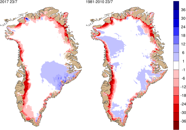
Left: Map of the surface mass balance today (in mm water equivalent per day). Right: The average surface mass balance for today’s calendar date over the period 1981-2010.
In the above figure, we show the daily surface mass balance (on the left) and you can see where it has snowed and melted (incl. sublimate) on the ice sheet over the last 24 hours. For comparison, the map to the right shows the average value for the same calendar date over the period 1981-2010. This historical average is based on weather from a somewhat different model and the two are therefore not always strictly comparable.
The surface mass balance is calculated over a year from September 1st to August 31st (the end of the melt season). The figure to the right shows the sum of all the daily changes from September 1st up to today. Next year on September 1st the map will be reset and we start over. This accumulated map illustrates how much the surface mass balance has contributed in each point across the ice sheet.
The figure below shows the total daily contribution from all points on the ice sheet (top) and the same accumulated from September 1st to now (bottom). The blue curves show this season’s surface mass balance in gigatons (Gt; 1 Gt is one billion tons and corresponds to 1 cubic kilometer of water), and for comparison the mean curves from the historical model run are shown with two standard deviations on either side. Note that the accumulated curve does not end at 0 at the end of the year. Over the year, it snows more than it melts, but calving of icebergs also adds to the total mass budget of the ice sheet. Satellite observations over the last decade show that the ice sheet is not in balance. The calving loss is greater than the gain from surface mass balance, and Greenland is losing mass at about 200 Gt/yr.
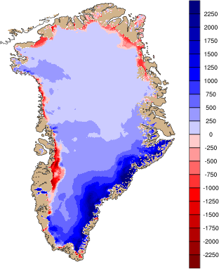
Map of the accumulated surface mass balance (in mm water equivalent) from September 1st to now.
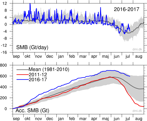
Top: The total daily contribution to the surface mass balance from the entire ice sheet (blue line, Gt/day). Bottom: The accumulated surface mass balance from September 1st to now (blue line, Gt) and the season 2011-12 (red) which had very high summer melt in Greenland. For comparison, the mean curve from the period 1981-2010 is shown (dark grey). The same calendar day in each of the 30 years (in the period 1981-2010) will have its own value. These differences from year to year are illustrated by the light grey band. For each calendar day, however, the lowest and highest values of the 30 years have been left out.
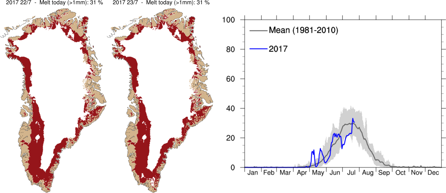
Left: Maps showing areas where melting has taken place within the last two days. Right: The percentage of the total area of the ice where the melting occurred from January 1 until today (in blue). For comparison the average for the period 1981-2010 is shown in the dark grey curve. The variation from year to year for each of the days during the melt season are shown as the gray shaded area.
These two maps show the area on the Greenland Ice Sheet where melt has occurred on the previous two days. The figure is shaded red where the model indicates melt of more than 1 mm / day. The total percentage of the ice sheet where melt has occurred is written at the top of the map.
The graph to the right of the maps shows the percentage of the area of the Greenland ice sheet that has melted every day this season on the blue curve. This can be compared with the dark grey curve that is the average melt area over the period of 1981-2010. The light grey band shows the differences from year to year as the range of each day through this period leaving out the most extreme high and low values each day.
This melt map only shows areas where melt has happened. It does not include evaporation directly from the ice sheet surface or show how much snow and ice has melted. Much of the melt water will refreeze in the surface snow layers rather than running off the ice sheet, this process is included in the calculations of surface mass balance which is why the melt area appears different to the surface mass balance plots above.
Due to gravity, ice flows slowly outwards like dough on a kitchen counter. When snow falls on top of the ice sheet year after year, the layers below are slowly compressed into ice. In the central part of the ice sheet, where little if any melt occurs, new layers will therefore continually be added. The ice does not grow in height, however, since the extra ice is balanced by the flow away from the center. Further out towards the coast we find the equilibrium line, where snowfall and melt are exactly balanced. Below the equilibrium line, there is more melt than snowfall and here the net mass loss is countered by the flow coming out from the center of the ice sheet. Here it is the ice sheet itself which melts.
For an ice sheet that neither grows or shrinks, there is at all points averaged over the year a balance between
· the amount of snow that falls and is compressed to ice
· the amount of snow and ice that melts or evaporates (sublimates) and
· the amount of ice that flows away due to the ice motion
The two first contributions make up the surface mass balance. For the ice sheet as a whole, there is a balance between the surface mass balance and the amount of ice that calves into the ocean as icebergs.
If climate changes, the surface mass balance may change such that it no longer matches the calving and the ice sheet can start to gain or lose mass. This is important to keep track of, since such a mass loss will lead to global sea level rise. As mentioned, satellites measuring the ice sheet mass have observed a loss of around 200 Gt/year over the last decade.
Greenland Climate Research Centre collaborates with DMI on research in both atmospheric impact on the Greenland Ice Sheet and the ice flow itself and its interaction with the rest of the climate system.
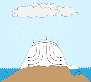
Three processes determine whether the ice sheet grows or diminishes. Accumulation of snow on top increases mass. In time, the snow is transformed to ice that flows down through the ice sheet and out towards the margins. Melt in the lower regions of the ice sheet and iceberg calving from glaciers reduces the mass. If mass loss exceeds mass gain the ice sheet will shrink.
Graphics Diego Winterborg.
We should revisit occasionally what the proper role of government is. As the constitution was a good sense of direction, we need a core set of principles to add in order to deal with the future.
So many want to engineer society, remove risk, assist certain groups, rather than let individuals thrive and raise communities. Why?
Is Democracy where we all "get it good and hard" or is it the best means to a free society?
Should we roll with the special interests, or make the government achieve its proper role, what is that role, and how to do this?
When do deficits and governments become too large?
Government is becoming more elitist while trying to sell corrections to problems it created, what makes this possible?
This could also be inserted into the field above, or erased
Currently as a society, we are having a most difficult time discussing political issues. What is driving this? And why a rebirth in political culture would be a good thing.
Are "markets" dead as some would conjecture? Or is free enterprise what got us here?
At the heart of economics there are several possible economic schools of thought, the essence of these schools of thought and how they relate to our lives.